Can the right vibrant colors turn a dull room into a lively haven?
The answer is yes. Different hues can make a space feel welcoming, energizing, or calming. This is because colors can evoke emotions and set the mood.
Studies show that colors greatly affect our mood and actions. By picking the right vibrant color scheme, you can make any space feel new and exciting.
Key Takeaways
- Discover how vibrant colors can transform a room.
- Learn about the psychological impact of different colors.
- Explore various vibrant color scheme ideas for your space.
- Understand the importance of color schemes in interior design.
- Get tips on choosing the right colors for your home or office.
The Psychology of Color in Interior Design
Understanding the psychology behind colors is key to creating spaces that evoke the right emotions. Colors can greatly affect our mood, how we see things, and our behavior. This makes them a vital part of interior design.
How Colors Affect Mood and Perception
Different colors can make us feel different ways. For example, blue makes us feel calm and serene. On the other hand, red can make us feel energetic and passionate. Studies show that colors have a big impact on our mood.

Cultural Differences in Color Interpretation
Colors mean different things in different cultures. For instance, white is seen as pure and innocent in many Western cultures. But in many Asian cultures, it’s a color of mourning. It’s important to know these differences to design spaces that respect everyone’s needs.
| Color | Western Culture | Asian Culture |
|---|---|---|
| White | Purity, Innocence | Mourning |
| Red | Energy, Passion | Good Luck, Prosperity |
Essential Color Theory Fundamentals
Color theory is key to making spaces look good and feel right. It’s all about the color wheel, a circle showing how colors connect.
The Color Wheel Explained
The color wheel shows how colors are linked. It begins with primary colors: red, blue, and yellow. These colors can’t be made by mixing others.
Primary, Secondary, and Tertiary Colors
Primary Colors are the basic colors. They are red, blue, and yellow.
- Red
- Blue
- Yellow
Secondary Colors come from mixing two primary colors. For example, blue and yellow make green.
Tertiary Colors are made by mixing primary and secondary colors. This creates colors like blue-green or yellow-orange.
Working with Tints, Shades, and Tones
Designers use tints, shades, and tones to add depth. These help make a color scheme richer.
- Tints are made by adding white to a color.
- Shades are made by adding black to a color.
- Tones are created by adding gray to a color.

Types of Color Schemes for Interior Spaces
A good color scheme can make any room look better and work better. It’s important for both homeowners and designers. There are many color schemes to choose from, each creating a unique look.
Complementary Color Combinations
Complementary colors are pairs that are opposite each other on the color wheel. They make a room look lively and interesting. For example, blue and orange or red and green work well together.
Monochromatic Color Palettes
Monochromatic schemes use different shades of one color. This creates a calm and elegant feel. You can change the brightness and saturation of a color to achieve this.

Analogous Color Arrangements
Analogous colors are next to each other on the color wheel. They make a room feel natural and soothing. For instance, blue, green, and yellow-green are good choices.
Triadic and Split-Complementary Schemes
Triadic schemes use three colors that are evenly spaced on the color wheel. They create a balanced and lively look. Split-complementary schemes pair a color with the two colors on either side of its complementary color. This creates a harmonious and interesting contrast.
Some popular color combinations include:
- Monochromatic neutrals for a clean and minimalist look
- Complementary colors for a bold and energetic atmosphere
- Analogous colors for a natural and soothing ambiance
- Triadic colors for a balanced and vibrant color scheme
By using different color schemes, you can make your space look great and work well. This is true for both homeowners and designers.
Popular Color Schemes for Modern Homes
Color schemes are key in modern home decor. They help set the mood and make a space feel welcoming. Modern homes are about looks and comfort.
Trending Color Combinations in 2023
This year, bold and vibrant colors are in. They add personality to homes. Some top colors include:
- Deep blues and greens for calm.
- Rich yellows and oranges for warmth.
- Soft pinks and blush tones for elegance.
Timeless Color Palettes That Never Go Out of Style
Some color schemes stay popular forever. They fit any modern home perfectly.
Neutral Bases with Bold Accents
Neutral colors offer a clean look. Bold accents add color and personality. This mix is easy to update with new trends.
Earth Tones and Natural Palettes
Earth tones like sage greens and driftwood grays are calming. They bring nature inside.

Using these colors, homes can be stylish and practical. Whether you want bold or calm, the right colors matter a lot.
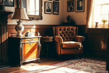
Creating Harmonious Color Schemes for Living Rooms
A well-chosen color scheme can turn your living room into a cozy retreat or a lively social spot. The goal is to find a balance between looks and use.
Balancing Function and Style Through Color
Think about the room’s purpose and the mood you want. For a room that’s both for relaxing and entertaining, pick colors that are soothing yet lively. Neutral tones like beige or gray can be calming. Accent colors add a pop of energy.
Color Schemes for Different Living Room Sizes
The size of your living room affects your color choices. Light colors can make small rooms look bigger. Dark colors can make large rooms feel cozier.
Open-Concept Living Space Solutions
Open-concept spaces need careful color planning to keep things harmonious. Using a unified color palette with different shades can help define areas.
| Room Size | Recommended Colors | Effect |
|---|---|---|
| Small | Light colors (white, cream, pale blue) | Makes room feel larger |
| Large | Darker colors (navy blue, dark gray, rich brown) | Creates coziness |
| Open-Concept | Unified palette with varying shades | Defines different areas |

By thinking about your living room’s size and use, you can pick a color scheme that boosts both its look and function.
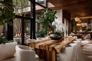
Kitchen and Dining Area Color Combinations
Kitchen and dining areas are the heart of the home. The right color scheme can make them warm and inviting. It can also stimulate appetite and foster conversation.
Cabinet and Countertop Color Pairings
Choosing the right colors for cabinets and countertops is key. A harmonious pair can elevate the space. But a mismatch can detract from it.
- White Cabinets with Granite Countertops: A classic look that’s clean and timeless.
- Dark Wood Cabinets with Quartz Countertops: Creates a sophisticated, modern vibe.
- Gray Cabinets with Marble Countertops: Offers a balanced, elegant design.
Creating Appetizing Atmospheres with Color
The colors in your kitchen and dining area can affect the ambiance and appetite. Warm colors like red, orange, and yellow can stimulate appetite. Cool colors like blue and green can create a calming atmosphere.
Here are some ways to create an appetizing atmosphere:
- Use warm-toned woods for cabinets and furniture.
- Add rich, earthy colors through accessories and decor.
- Include vibrant colors through kitchen utensils and diningware.
Two-Tone Kitchen Color Schemes
Two-tone kitchen color schemes are popular for adding depth and interest. They let you create a unique look that reflects your style.
Here are some popular two-tone combinations:
- Navy Blue and White: A classic nautical look.
- Black and Stainless Steel: Great for a modern, industrial vibe.
- Warm Wood Tones with Crisp White: Offers a cozy, traditional feel.
By choosing the right colors for your kitchen and dining area, you can create a beautiful and inviting space.
Bedroom Color Schemes for Restful Retreats
A well-designed bedroom color scheme can turn your space into a cozy retreat. The right colors can help you relax, sleep better, and feel calm.
Calming vs. Energizing Bedroom Palettes
Choosing the right bedroom colors is key. Calming colors like soft blues and pale greens make your room peaceful. On the other hand, bright yellows and oranges can wake up your mind and body.
Soft blues and pale greens are great for a calm vibe. They bring feelings of peace and quiet.
Children’s Bedroom Color Ideas
For kids’ rooms, you can go for fun and bright colors. Try mixing corals, lavenders, and mint greens. It makes the room lively and full of imagination.
Master Bedroom Color Combinations
In master bedrooms, choose colors that are calm and elegant. Deep grays with soft whites or taupe with blush tones are perfect. They make the room feel luxurious and peaceful.
| Color Scheme | Description | Ideal For |
|---|---|---|
| Soft Blues and Whites | Calming and serene | Master Bedrooms |
| Bright Corals and Lavenders | Playful and vibrant | Children’s Bedrooms |
| Deep Grays and Soft Whites | Sophisticated and relaxing | Master Bedrooms |

By picking the right colors, you can make your bedroom a peaceful and functional space. It becomes a true retreat where you can relax and unwind.
Bathroom and Small Space Color Schemes
In bathrooms and small spaces, the right color scheme can make the area feel bigger and more functional. It’s key to pick colors that open up the space and make it cozy.
Making Small Bathrooms Feel Larger with Color
To enlarge small bathrooms, use light, reflective colors on walls and ceilings. White, soft blues, and pale greens can make a room feel bigger. Stay away from dark colors, as they can make the space feel tight.
Spa-Inspired Color Palettes
Spa-inspired colors include soft grays, creamy whites, and natural wood tones. These hues help create a calm and peaceful atmosphere, perfect for bathrooms.
Powder Room Statement Colors
Powder rooms are great for bold colors. Try deep jewel tones, rich berry shades, or dramatic blacks. These colors add luxury and make a lasting impression on guests.
| Color Scheme | Ideal For | Effect |
|---|---|---|
| Light, reflective colors | Small bathrooms | Makes space feel larger |
| Spa-inspired palettes | Bathrooms, relaxation areas | Promotes relaxation |
| Bold, statement colors | Powder rooms | Creates a luxurious experience |
Color Schemes for Different Design Styles
Different design styles need unique color schemes to make a space look great. The right colors can make a room more beautiful and unified.
Modern and Minimalist Color Palettes
Modern and minimalist designs focus on simplicity and function. They use a neutral base with bold colors for accents. Common colors include whites, blacks, and grays. Furniture and decor add pops of color.
Bohemian and Eclectic Color Combinations
Bohemian and eclectic styles love individuality and creativity. Their color schemes are lively and layered. They mix earthy tones with rich jewel colors. Patterns and textures add depth and interest.
Traditional and Classic Color Schemes
Traditional and classic designs are all about timeless beauty. They use warm, rich colors like beiges, creams, and soft blues. These colors make spaces cozy and welcoming, ideal for classic rooms.
Industrial and Mid-Century Modern Color Ideas
Industrial and mid-century modern styles are known for their unique mix of function and retro charm. They use neutral tones with bold accents. Colors are influenced by exposed brick, metal, and reclaimed wood, adding earthy and industrial hues.
Seasonal and Transitional Color Schemes
When the seasons change, our homes can feel old if we don’t update them. Changing our color schemes to match the season keeps our homes lively and welcoming.
Spring and summer bring new life and warmth. This is shown in lighter, brighter colors. Think about using pastel shades, soft whites, and bright yellows to brighten up your space.
Spring and Summer Palettes
Pastel colors and soft whites can make your home feel calm. But, vibrant yellows and oranges can add a burst of energy.
Fall and Winter Combinations
When fall and winter come, switch to warmer colors for a cozy feel. Use rich oranges, deep reds, and earthy greens in your decor.
Updating with Accessories and Textiles
It’s easy to change your home’s colors with the seasons. Just swap out things like throw blankets, pillows, and rugs to match the season.
Practical Tips for Implementing New Color Schemes
To make a new color scheme work, think about a few important things. A good color scheme can make your home look fresh and welcoming. It’s all about creating a harmonious and appealing space.
The 60-30-10 Rule for Color Distribution
The 60-30-10 rule is a helpful guide for color distribution. It says 60% of the room should have a main color, 30% a secondary color, and 10% an accent color. This balance makes the room look good and feel right.
Testing Colors Before Committing
It’s key to test colors before you decide on a scheme. You can paint swatches on walls or use online tools. This way, you see how colors look at different times and under different lights.
Working with Existing Furniture and Fixtures
You don’t have to replace everything when changing your color scheme. Think about how to use what you already have. For example, you can repaint or reupholster furniture to fit your new colors.
Digital Tools and Apps for Color Planning
There are many digital tools and apps for planning colors. They let you upload pictures and try out different schemes. Some top picks include color picker apps and interior design software.
| Tool/App | Description | Platform |
|---|---|---|
| Color Hunt | A color palette inspiration platform | Web, Mobile |
| Homestyler | Interior design software with a vast library of furniture and decor | Web, Mobile |
| Adobe Color | A tool for creating and exploring color palettes | Web |
Conclusion: Creating Your Perfect Color Story
The right color scheme can change any space, making it more inviting and useful. By learning about color psychology and theory, you can tell a unique story with your home’s colors.
Your color story shows who you are and what you like. You might prefer bright colors or calm ones. The important thing is to find a mix that feels right to you. Think about the mood you want in each room and try out different colors.
Starting this journey means trusting your own taste and enjoying the process. Color selection is a personal choice. With patience and creativity, you’ll create a space that’s truly yours. It will be a place where you make lasting memories.